Difficulty: Beginner
This tutorial covers the creation of a basic menu system with a Play and Exit button using UMG (Unreal Motion Graphics), Unreal’s UI system. This tutorial does not cover health/ammo bars or screen resolution settings. A more advanced tutorial for those can be found here
Before we start, remember that the numbers I use are not all strict! Button and text positions, sizes, etc, are all design choices and don’t have to be followed exactly.
Note: We will be using the blueprint First Person template as our starting point.
Tip: Creating folders for organization makes it really easy to find specific Blueprints.
I will be creating my UMG files in FirstPersonBP/Blueprints/UMG/. You can create this folder and work in here as well, but it’s not required.
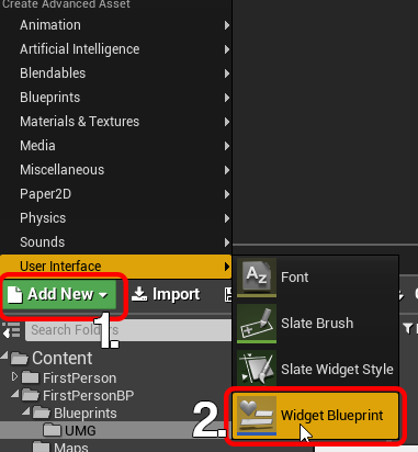
1. On the Content Browser panel at the bottom of the editor, click Add New -> User Interface -> Widget Blueprint. A Widget is any element that is displayed on the player’s screen, like a health bar, or in our case, a menu.
This will create a new file, called NewWidgetBlueprint. We can immediately rename it.
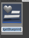
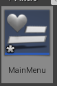
2. Rename the file to MainMenu and hit Enter.
3. Open the file to open our new Widget file. This new window is where we will be creating everything widget related.
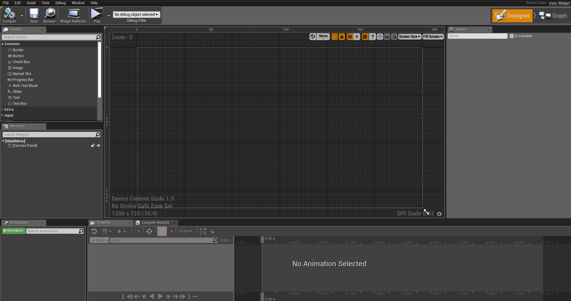
Let’s start making our menu! On the Hierarchy panel on the left, we are given one element to start with: the Canvas Panel. This is a panel that allows other elements to be placed wherever we want easily. Think of it as a Photoshop layer.
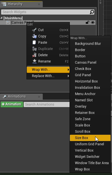
5. In order to make the menu scale correctly on different screen resolutions and sizes, we need to wrap our Canvas Panel in a Size Box and Scale Box. This isn’t absolutely necessary, but it’s a good practice in order to prevent menus from cutting off screen. If you don’t want to do this, skip to step 10.
6. Right Click the Canvas Panel on the Hierarchy and select Wrap With -> Size Box.
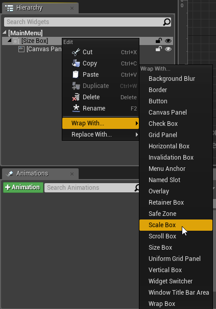
7. Right Click on the Size Box and select Wrap With -> Scale Box.
8. Since our Size Box is already selected, let’s configure that. On the right side of the screen, there is a Details panel. This allows us to configure each Hierarchy element.
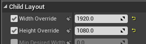
Left Click the Check Boxes on Width Override and Height Override to enable them.
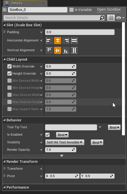
9. Left Click on the 0.0 next to Width Override to enter a value. Enter 1920. After, Left Click on the 0.0 next to Height Override and enter 1080. The result should then look like this, with two yellow arrows next to the numbers. These settings are making sure that the entire menu we make here is shown on the player’s screen, so buttons and text won’t be cut off the screen.
10. Now that the scaling is set up, let’s start designing it.
Click and drag the Text element from the Palette onto our Canvas Panel layer in the Hierarchy.
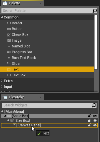
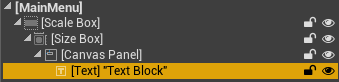
Release LMB to create the Text widget on our Canvas Panel
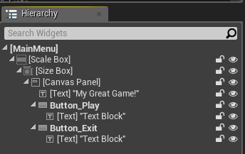
11. Add two Button elements from the Palette panel the same way we did added the text. After, our Hierarchy should look like this:
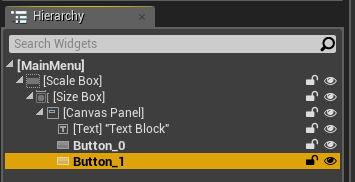
Tip: You can press F2 while a widget element is selected on the Hierarchy to rename it.
Now, we’re going to center all of the elements on our screen. If you don’t want to do this, skip to step 13.
12. CTRL + Left Click the Text and two Buttons to select them all. Now, when we change settings on the Details panel, it will affect all of them at once.
13. On the Details panel on the right, Click on the Anchors dropdown list and select the Centered icon
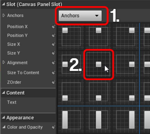
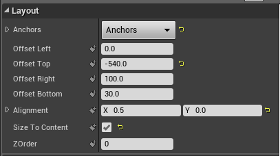
12. Under Alignment, enter X: 0.5. Centering text with this method will always use 0.5 alignment, no matter the situation.
Enable Size To Content by checking the check box.
After those are set, change Offset Left to 0. This will center everything horizontally. Our Details panel should look like this:
13. Select the Text Box on the Hierarchy to select that element individually. We’re going to change the text that shows up on the screen.
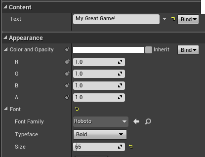
14. Under the Content section of the Details panel, you can enter your game’s name. Under the Appearance section, you can change your font color and size. Change Size to 65.
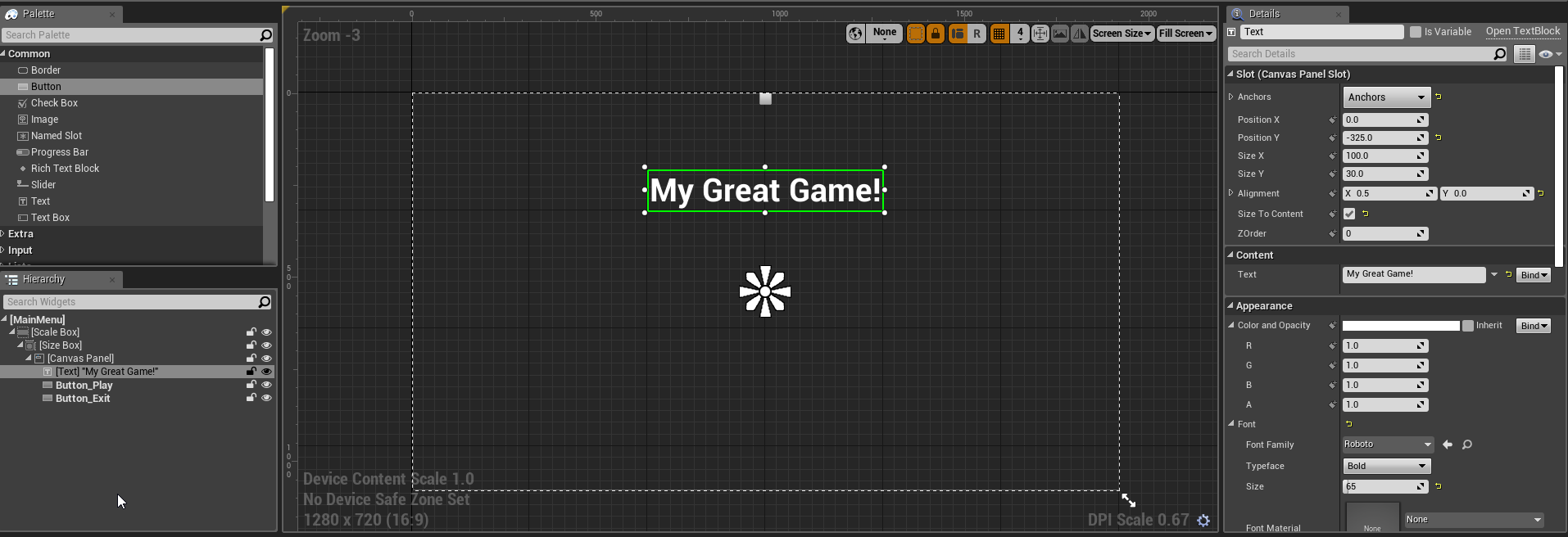
15. Now you can position the text wherever you’d like. Since we already centered it horizontally, we can just change the Y position. Under the Slot section at the top, change Position Y to -325. Our menu should look like this:
16. Drag a Text element to each Button on the Hierarchy.
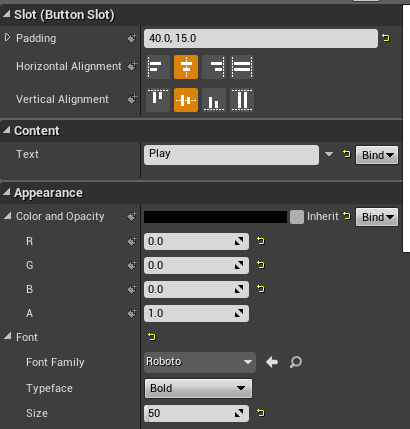
17. Select the Text item under Button_Play so we can change its details. Under the Details panel, change
Padding to 40,15.0
Text to Play
Color and Opacity to R 0.0 G 0.0 B 0.0. This is solid black.
Font Size to 50
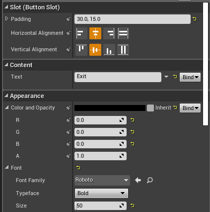
18. Select the Text item under Button_Exit and change Padding to 30,15 and change Text to Exit. Use the same settings as before for everything else.
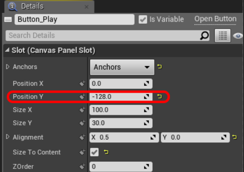
19. Select the Button_Play item in the Hierarchy and change its Position Y to -128
19. Select the Button_Exit item in the Hierarchy and change its Position Y to 50.
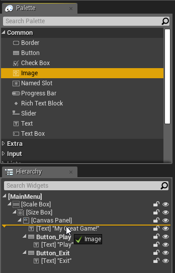
20. Ok, all the buttons are all in place. Let’s add a quick solid background color so we don’t have menu buttons floating in the player’s screen like a HUD. Drag and drop an Image element from the Palette to in between the Canvas Panel and Game Title Text.
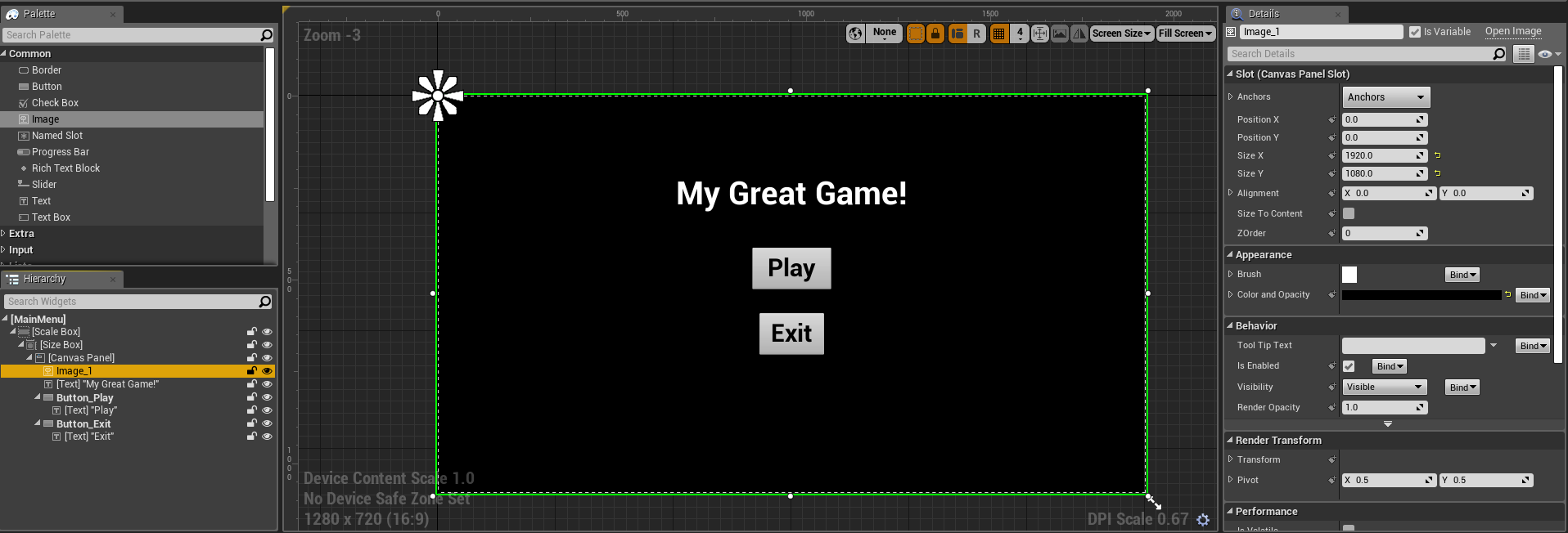
21. Click on the Image in the Hierarchy and change its Size X to 1920 and Size Y to 1080. The Color and Opacity can be any color, but let’s change it to black. Change the Color and Opacity to R: 0 G: 0 B: 0.
Tip: Click “Save” (at the top left) frequently in case something happens!
All the buttons are in place, and everything’s looking good. Now let’s actually make these buttons do stuff.
22. Select Button_Exit and scroll to the bottom of the Details panel. This is how we can start controlling how a button is interacted.
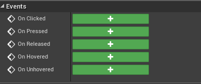
Tip:
On Clicked activates when the person left clicks and then lets go of left click.
On Pressed activates when the person left clicks.
On Released activates when the person lets go of left click.
On Hovered activates when the person’s mouse cursor hovers over the button
On Unhovered activates when the person’s mouse leaves the button.
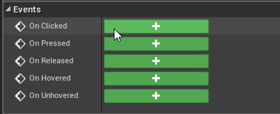
23. Click the Green Button next to the On Clicked event to add it to the event graph.
After clicking, it will drop a node into the event graph corresponding to the action you just picked.
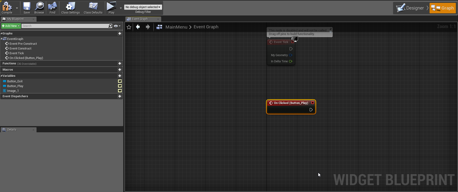
Unreal Engine 4 has a neat programming system called Blueprints. Rather than have everything coded traditionally in text, Blueprints are nodes that represent the code in visual form. In all of the Blueprints, a tab called the Event Graph is where all the cool scripting stuff happens.
You can switch back to the designer at any time by clicking Designer at the top right
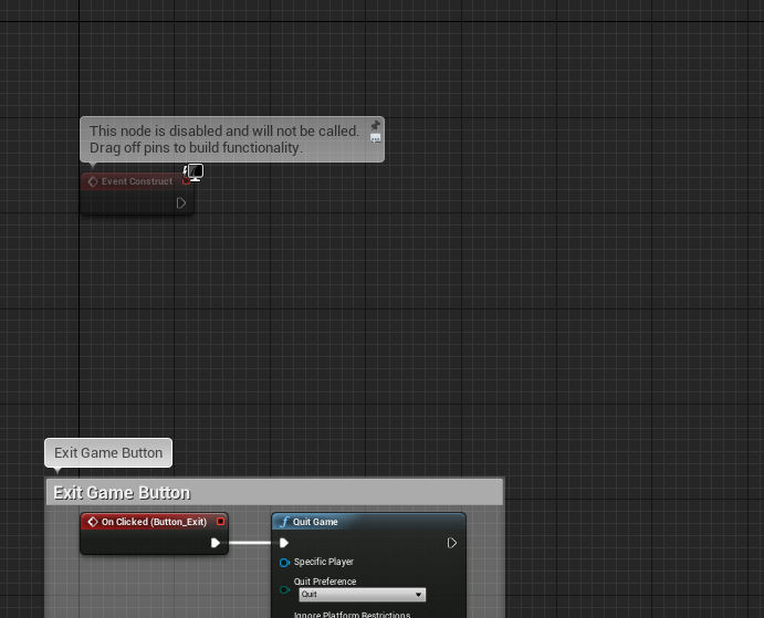
24. The exit game button is really easy to implement. Click and drag from the arrow on the red On Clicked node, and type Quit. Hit Enter and the quit node will be created
The white line between the two nodes means they’re connected, and white lines in Blueprints usually means the attached functions are being run. In this instance, when the button is clicked, it runs the node “Quit Game”, which exits the game.
By selecting multiple nodes and pressing C, we can make a comment block which helps organize the Event Graph.
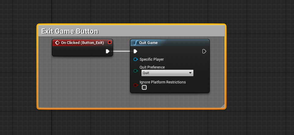
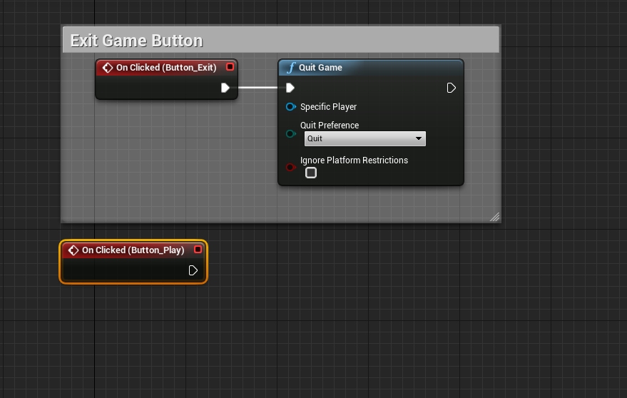
That’s all that needs to be done with the Exit button, now let’s move on to the Play button.
25. Just like before, select the Play button item in the Hierarchy. On the Details panel, scroll to the bottom and click On Clicked. This will add another node to the Event Graph
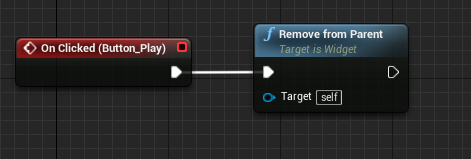
26. Drag a line from the output of the On Clicked node and add the Remove From Parent node. This closes the entire menu
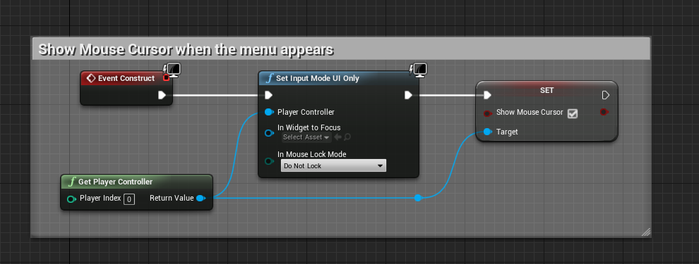
27. From there, add a Get Player Controller node, and connect a Set Input Mode Game Only node. Connect the output to a Set Show Mouse Cursor node.
Tip: Hold RMB and drag to navigate the Event Graph
We haven’t made the player’s cursor appear when the menu opens, so let’s do that now.
28. Move up to the grayed out Event Construct node above our nodes. Any node grayed out like this is not used. Once anything is connected to a grayed-out node, the event is enabled and will be run normally.
29. The Event Construct node is run when the widget is created on screen, so let’s make the player’s mouse appear when the menu opens.
Connect the Set Input Mode UI Only and Show Mouse Cursor to the Event Construct node, and click the checkbox on the Show Mouse Cursor to enable it.
Make sure to Save and Compile (next to save).
The menu’s all done now! Now we have to actually open it when the game starts. To do this, we have to edit the player’s character Blueprint.
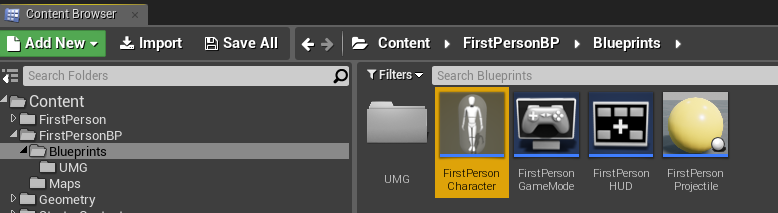
30. Navigate to and open FirstPersonCharacter in FirstPersonBP/Blueprints/
31. If you followed the tutorial on how to remove the default weapon, you will not have a BeginPlay node in the Event Graph. If you do, that’s not problem, and the nodes from step 32 will be attached to the end of the BeginPlay event.
Right Click on the Event Graph and create a BeginPlay node. This node is run whenever the player’s character spawns in.
32. Add the Create Widget node and select the MainMenu widget on the Class dropdown.
Add an Add To Viewport node connected to the Return Value on the end of the Create Widget node.
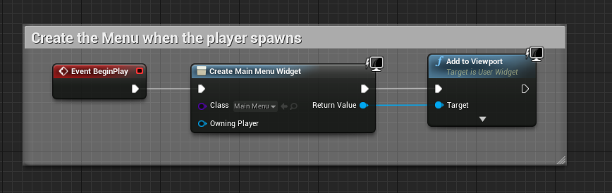
Compile and Save.
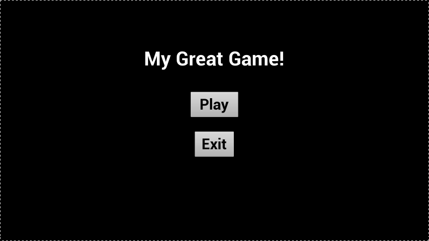
And that’s it! You now have a basic main menu that appears when the game starts.
The next tutorials will cover creating a win and lose screen, as well as a pause menu. For those, we can reuse this menu.